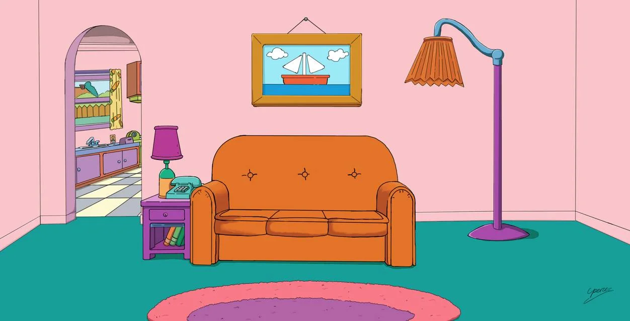
The Simpsons house reimagined
The Simpsons’s home is as Iconic as the characters themselves. So I am super happy that the collaboration we did not think we needed happened, as Angieslist.com teamed up with Interior designer Pat McNulty to give 742 Evergreen Terrace a makeover applying current Interior trends.
The Living Room - Luxe Style
The living room is designed in a luxe style with a plush blue velvet sofa and brass finishes on the drinks trolley, floor lamp and newly introduced coffee table. A statement chandelier brings the look together nicely. I love that the dusty pink walls have remained, with the boat picture replaced with an large off-centred abstract painting. The complementary armchair makes the room relevant within the current design era.
The Kitchen - Smart Home Style
Out is the original dayglo decor of the kitchen, and it is in with a smart home design style that puts emphasis on todays gadget focused design aesthetics. I feel that the kitchen is the heartbeat of the show and the characters’ relationship with the audience, due to the relating associations. The reimagined kitchen also takes on a very minimal colour palette. I do love the pinned back design of the dining chairs. The original black and white floor tiles were kept, which I love!
Marge and Homer’s bedroom - Industrial Style
I am a big fan of Industrial style. It has such an powerful presence when done in a more minimal way. The calming vibe of the room is emphasised by the cool and neutral tones. The exposed brick works well with the reclaimed wood headboard and simple white bed frame and TV unit.


